Guide to R Commands
This list is meant to be used as a reference. Seeing all the commands at once can be overwhelming. You should follow the labs for a more smooth introduction to programming in R.
The main use of this guide is to find out the common options that can be added to these commands. Throughout the guide, sections enclosed in angle brackets like this: <dataset> are placeholders meant to be replaced by the appropriate text for your data.
Data Preparation
Commands in this section involve data preparation, for instance loading new data or filtering a data set.
read_csv
read_csv is used for loading comma-separated-format (CSV) files. This is a popular format for transmitting data, and works well with spreadsheet programs like Excel. Excel can read CSV files and can also export/save to CSV format.
In RStudio you can use the Import Dataset > From CSV menu option, and it will create the appropriate read_csv command for you.
Options
file="..."is the first option, and you can omit thefile=part for it. The quoted expression specifies which file to load. If the file is online, all you need to use is the web link to the file. If it is on your computer, it should hopefully be in the “working directory”. In that case you just need to provide the filename.
There are many other more specialized options, for situations when the initial dataset is not properly formatted. We will not discuss them here, but you can read more on the documentation page ?read_csv.
Examples
data
data is used to load data that was saved in an R package. It is typically followed by the View command.
If used with no arguments, as data(), it will list all datasets available in all loaded packages.
Options
The data command has a simple syntax. It expects simply the name of the dataset. The only option worth mentioning as an addition is package="..." where you can specify which package the data comes from. It is usually not needed.
Examples
View
View is used to bring up a spreadsheet view of a dataset. The dataset must have been previously created, by read_csv, data or some other method.
Examples
head, tail
head and tail can be used in order to extract the first few, or the last few, cases from a dataset. They can often be used as the last step in a piping sequence in order to see the top results from our operation.
Both functions take two arguments: The name of the object (often provided via piping) and the number of cases to show, which defaults to around 6.
Examples
filter
TODO
Summaries
Commands in this section produce numerical summaries.
The Formula Interface
Most of the commands we are using expect the variables to be specified via a formula interface. A formula in general looks as follows:
Here the left-hand-side may be completely absent and the vertical line and groups part may also be absent. Both sides contain the variables to be considered, and multiple variables can be separated by a plus sign.
- lhs
- The variables on the left-hand-side are the target variables and we are interested in how they are influenced by the other variables. When doing a scatterplot,
lhscorresponds to the y axis. - rhs
- The variables on the right-hand-side are the source variables and we are interested in themselves if there is no left-hand-side, or how they influence the variables in the left-hand-side if there are any.
- groups
- The variables in the groups section are meant to be variables used to break down the results. If used in a graph situation for example, the graph would have a different panel for each value of the group variables.
Examples
Piping
The piping operatior, %>%, is a very useful operator that allows us to simplify the writing of complex steps. The operator takes the value on its left side, and uses it as the first argument in the function on its right side. Here is one example:
healthVsExercise <- tally(~genhealth|exerciseany, data=brfss)
healthVsExercise %>% t() %>% barchart()
The first line creates a new table, healthVsExercise, with the tallies. The second line takes that table, and feeds it into the t function, and then feeds the result into the barchart function. That line is exactly the same as the following much harder to read expression:
summary
summary can be used on the whole dataset, to get a quick overview of the various variables and their summaries.
Options
Typically you do not need to add any options to this method.
digits: You can control how many digits are shown by adding thedigits=...option.maxsum: You can determine how many categories (including the missing values category) will show from factors by adding themaxsum=...option. The most frequent categories are shown first.
Examples
tally
tally is used to produce frequency tables and cross-tabulation tables for categorical variables. The first argument should be a formula involving the variables to use, and it should be followed by a data=<dataset> option specifying which dataset to use.
Options
By default tally will create a table of frequencies for the various combinations of values.
sort: You can specifysort=TRUEif you want to options to be sorted in order of frequency. By default they will be ordered in the order specified in the variable.format: By defaulttallywill produce frequency counts. You can change that behavior with theformatoption. Most common values are"count"(the default),"percent","proportion"and"data.frame"(produces a dataset of the results, useful for further processing).margins: You can add the optionmargins=TRUEif you would like to see marginal probabilities (totals) added to the table.useNA: You can adduseNA="no"to remove the missing values from the computations and the result.
Examples
Aggregating Functions
There is a long list of commands that all follow a similar syntax, and all aggregate values of some variable, possibly broken down by other categorical variables. They all have the syntax:
<command>(<formula>, ...options)The formula has the form <aggregatingVariable>~<breakDown1>+<breakDown2>... where the variable on the LHS is the scalar variable to be aggregated, and the variables in the RHS are the categorical variables by which to break the groups down.
The usual commands are:
meanfor the variable’s meanmedianfor the variable’s mediansdfor the standard deviationvarfor the variance (square of standard deviation)iqrfor the interquartile rangefavstatsfor the five-number summary, mean, median and countrangefor the range of the values (maximum minus minimum)maxfor the maximum of the valuesminfor the minimum of the valuessumfor the sum of the valuesprodfor the product of the values
Options
All commands accept the same options:
data: adddata=<dataset>to specify the dataset to usena.rm: addna.rm=TRUEto remove the missing values before computing. Most of the functions above will simply returnNA, representing missing value, if there are any missing values present andna.rm=TRUEwas not added.
Examples
# Stats on number of days per month with physical/mental health problems,
# broken down by general health
mean(physhealth~genhealth, data=brfss, na.rm=TRUE)
mean(menthealth~genhealth, data=brfss, na.rm=TRUE)
favstats(menthealth~genhealth, data=brfss, na.rm=TRUE)
# Total state population by adding the county populations
sum(pop2010~state, data=counties, na.rm=TRUE)
# Stats for percent of blacks in county, broken down by state
favstats(black~state, data=counties, na.rm=TRUE)
Plotting
Commands in this section produce graphical summaries. Before we look at individual commands, we discuss options common to most graphs.
Common Graph Options
These options can be added to most graph commands:
xlab="..."specifies the label for the x axis.ylab="..."specifies the label for the y axis.main="..."specifies the main graph title, which appears at the top.col=...specifies what colors to use for the various elements. Look at the Color Specifications section for more details.pch=...can be used on graphs with points to choose what point-style to use. The options are summarized in this image: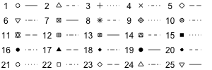
pch and lty options The icons 21-25 can use a fill-in (background) color, via the
bg=...command. Usec(..., ...)for multiple values.lty=...can be used on graphs with lines to choose the line style to use. The graph above shows the options for line types. Usec(..., ...)for multiple values.lwd=...can be used on graphs with lines to specify the thickness of the lines, 1 being the standard size. For instancelwd=1.4will draw the lines 40% thicker.cex=...can be used to change the size of the objects in the graph, 1 being the standard size. For instancecex=1.2will draw the objects 20% bigger.xlim=c(a, b)sets the range on the x axis to be fromatob.ylim=c(a, b)sets the range on the y axis to be fromatob.auto.keyandkey: These options are used for to add legends to graphs that need them. For details look at the corresponding section.layout: TODO
Legend Specifications
Legends are needed when we use a grouping variable, to identify the different colors and symbols used. Adding a default legend is easy to do. However, customizing the legend and the graph in general becomes trickier.
To specify the legend you have two options you can add to graphs:
- auto.key
The
auto.keyoption is a convenient way to add a legend, but it will only work if you don’t set custom colors to your graph. Its form isauto.key=list(...)where the dotted area may be empty or contain any of the following options: -space="..."will specify which side the legend goes in (top, bottom, left, right). The default is top. -columns=...will specify in how many columns to split the legend. The default is one column, so all values form a single column.- key
The
keyoption allows for more fine-tuned legends, but it is also more complex to write. This is definitely an advanced feature. With this option you have to manually specify everything that goes into the graph, including the various labels for the grouping variable. It would typically be constructed in steps, like in this example:# First we specify the colors we will use. We use 5 keys here. myColors <- brewer.pal(5, "RdPu") # Next we create the levels myLabels = list(levels(brfss$genhealth)) # Now we create a list of key components. We use "text" to set the labels, # "columns" to specify how many columns to show, and "rectangles" to # tell the legend to draw colored rectangles with our colors in. myKey = list(text=myLabels, columns=4, rectangles=list(col=myColors)) # Finally, we use the key in a graph We must specify the colors again healthVsExercise <- tally(~genhealth|exerciseany, data=brfss, format="percent", useNA="no") healthVsExercise %>% t() %>% barchart(col=myColors, key=myKey)Instead of, or in addition to,
rectangles, we could also uselinesandpointsto add those symbols. You can use most of the common graph options to specify these lines and symbols, just like we usedcolabove.
Color Specifications
Graph colors can be specified in a variety of different ways. We outline these different ways here. They are to be used with the col=... graph option.
- By name
R has over 650 built-in color names that you can use. Run the command
colors()to see the different options. An example use would be:col=c("grey5", "skyblue3")- By grayscale
You can specify a degree of grayness by using the
gray(...)function and specifying numbers between 0 (black) to 1 (white). An example use for 4 colors would be:col=grey(0, 0.2, 0.5, 0.8)- By palette
The colorBrewer library contains custom palettes designed for various uses. You can see all the different palettes and their names by using the command
display.brewer.all(). They fall into three categories:- sequential palettes, starting from a fairly white color and getting progressively darker. Good for ordered categorical data.
- diverging palettes, with a middle neutral color and diverging in two directions. Good for ordered categorical data with a middle neutral value and negative/positive sides.
- qualitative palettes, with easy to distinguish colors, useful for nominal (unordered) categorical variables.
In order to use a palette, you would use the command
brewer.pal(<n>, <name>)where<n>is the number of colors to choose, and<name>is the palette’s name, in quotes. For instance to use four colors from the “Accent” palette we would do:col=brewer.pal(4, "Accent")
histogram
histogram is used to produce histograms. The typical syntax would use a formula ~<variable> as the first argument, followed by a data=<dataset> option to specify the dataset to use.
You can also create multiple panels based on the values of a categorical variable, with a formula ~<variable>|<factorVariable>.
Options
breakscan be used in two ways, but the simplest one is to set it equal to a single number, specifying the number of breakpoints to be used for the histogram bars.typemust equal one of"percent","count"or"density"and determines what the heights of the bars correspond to:"count"means the height of each bar corresponds to the number of cases in that range. If you were to change the default type, this is probably what you would choose instead."percent"(the default) means that the height of each bar corresponds to the percent of cases in that range."density"means that the area of each bar corresponds to the percent of cases in that range.
Examples
barchart
barchart is used to produce bar charts. It is typically used by first doing a tally and then piping the result into barchart.
Options
horizontal: By default the bars will be horizontal. If you would prefer vertical bars, add the optionhorizontal=FALSE.origin: Barcharts should start at 0, but sometimes the default setting does not force that behavior. Setorigin=0to achieve that.
Examples
100% Stacked Bar Charts
100% stacked bar charts are somewhat tricky to make. We start with a tally with the two variables separated by a vertical line (not plus!), then set the format to percent. Before piping that into a barchart, however, we have to pipe it through the t command, which transposes columns and rows. The main syntax would look like this:
tally(~genhealth|exerciseany, data=brfss, format="percent") %>% t() %>%
    barchart(auto.key=list(space="right"))
You may have to swap the two variables to get them in the desired order.
seq quantile Histogram: breaks (both forms),
Cleanup
bargraph (mosaic) MIGHT NOT NEED?
barchart (lattice) barchart better for Pareto charts…
mosaicplot (mosaic)
xyplot (lattice)
ladd (mosaic)
panel.abline (lattice)
…
tally (mosaic)
head, tail (base)
summary (base)
names (base) MIGHT NOT NEED
arrange (dplyr) MIGHT NOT NEED
favstats (mosaic)
sort (base)
%>% (dplyr)
filter (dplyr)
tally(~state, data=counties) %>% sort()
median et al from mosaic ( median(~pop2010|state, data=counties) )
View (rstudio)
pdist, xpnorm, xqnorm, xpbinom (mosaic) FOR VISUALIZING THEORETICAL DISTRIBUTIONS